
Badge Banner
View DemoBadge Banner stands out by anchoring the icon badge in the corner of the banner. Insert this ad format between the site section to maximize its impact.
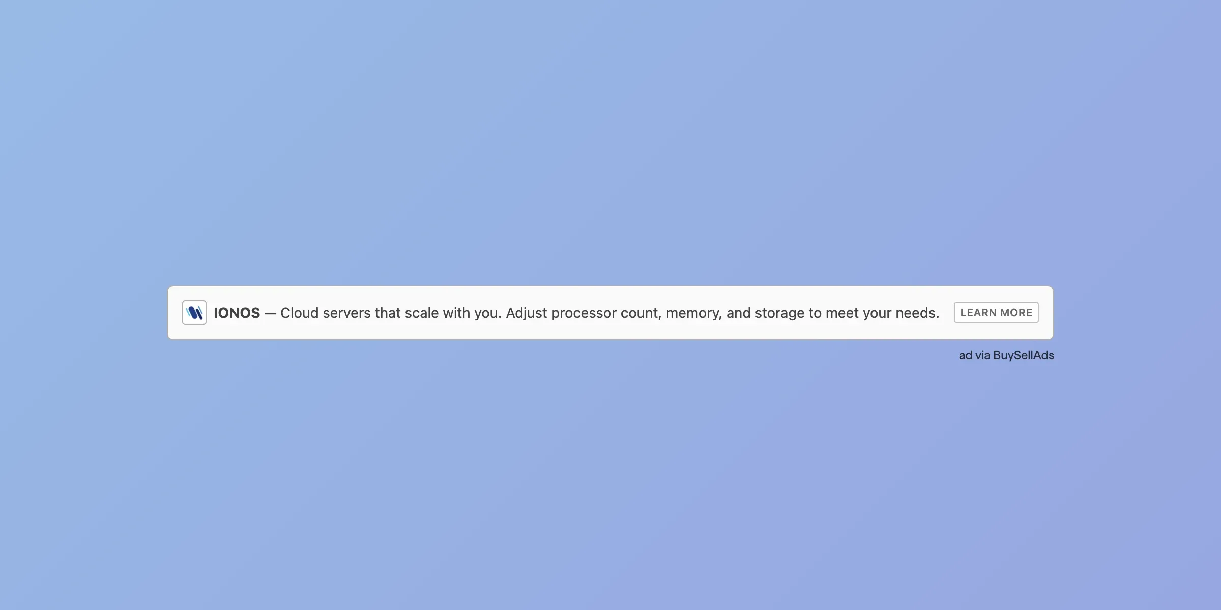
Capsule Bar
View DemoCapsule Bar is a compact, inline ad with logo, message, and CTA. Best placed in content feeds, dashboards, or headers where subtle visibility drives high intent clicks.
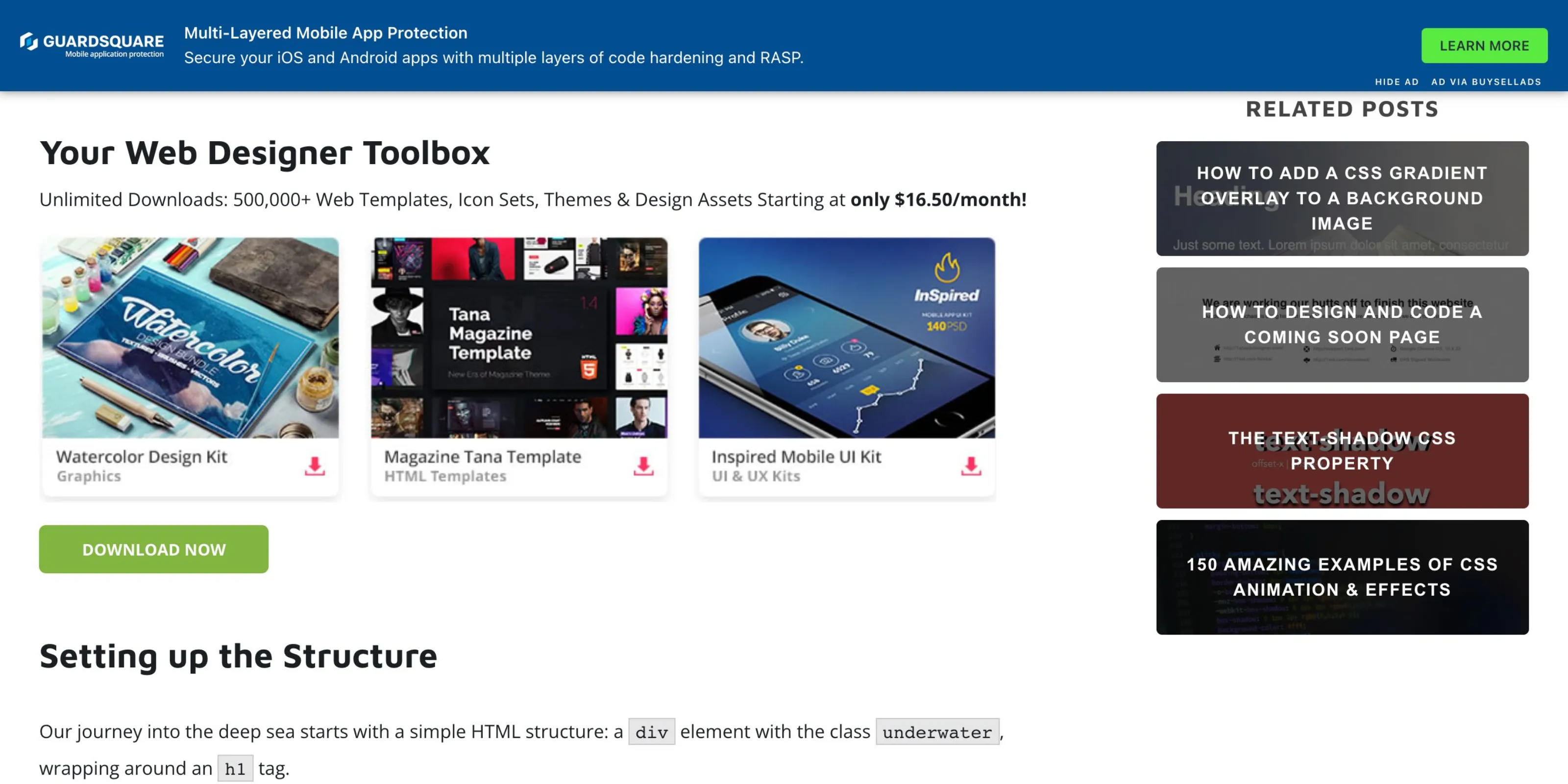
Fancy Bar
View DemoFancy Bar is only visible when the site visitors scroll down the page. It's suitable for site with long form content where you want to keep the ad visible all the time.
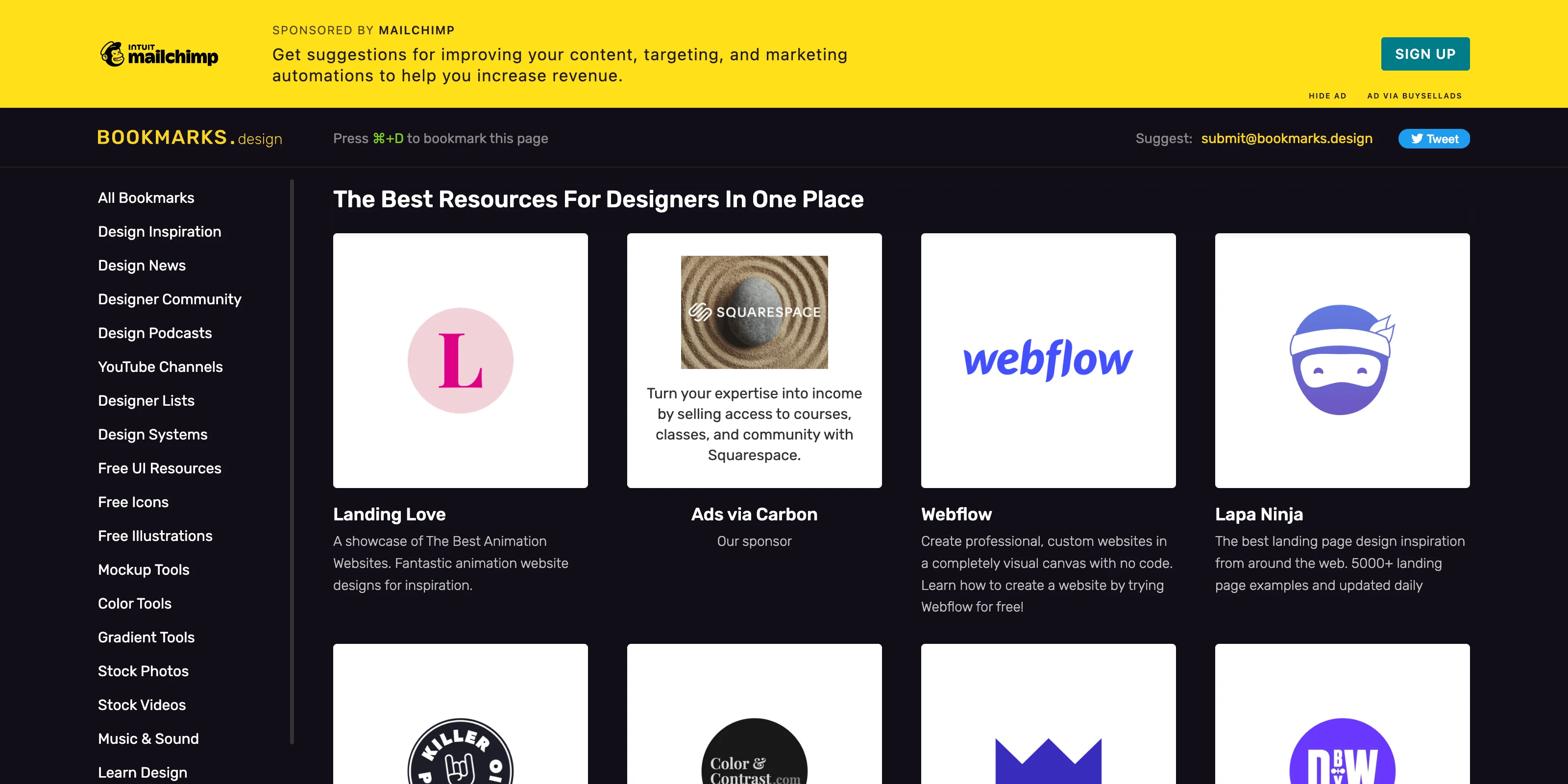
Flex Bar
View DemoFlex Bar works by allowing you to integrate the ads while keeping the site layout untouched. It's visible above the website's container and can be hidden for six hours.
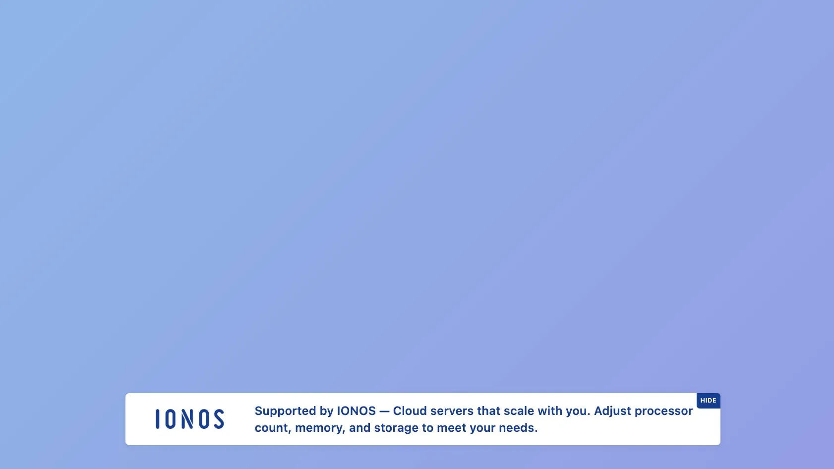
Hello Bar
View DemoHello Bar is only visible when the site visitors scroll down the page. It appears in the bottom of the page if you wish to have an ad unit with smaller size.
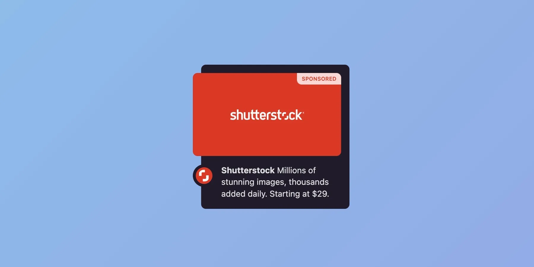
Hover Card
View DemoHover Card is a fun and interactive ad format that animates when you "hover" it. You can use it when you want something different from the standard rectangle and leaderboard ad format.
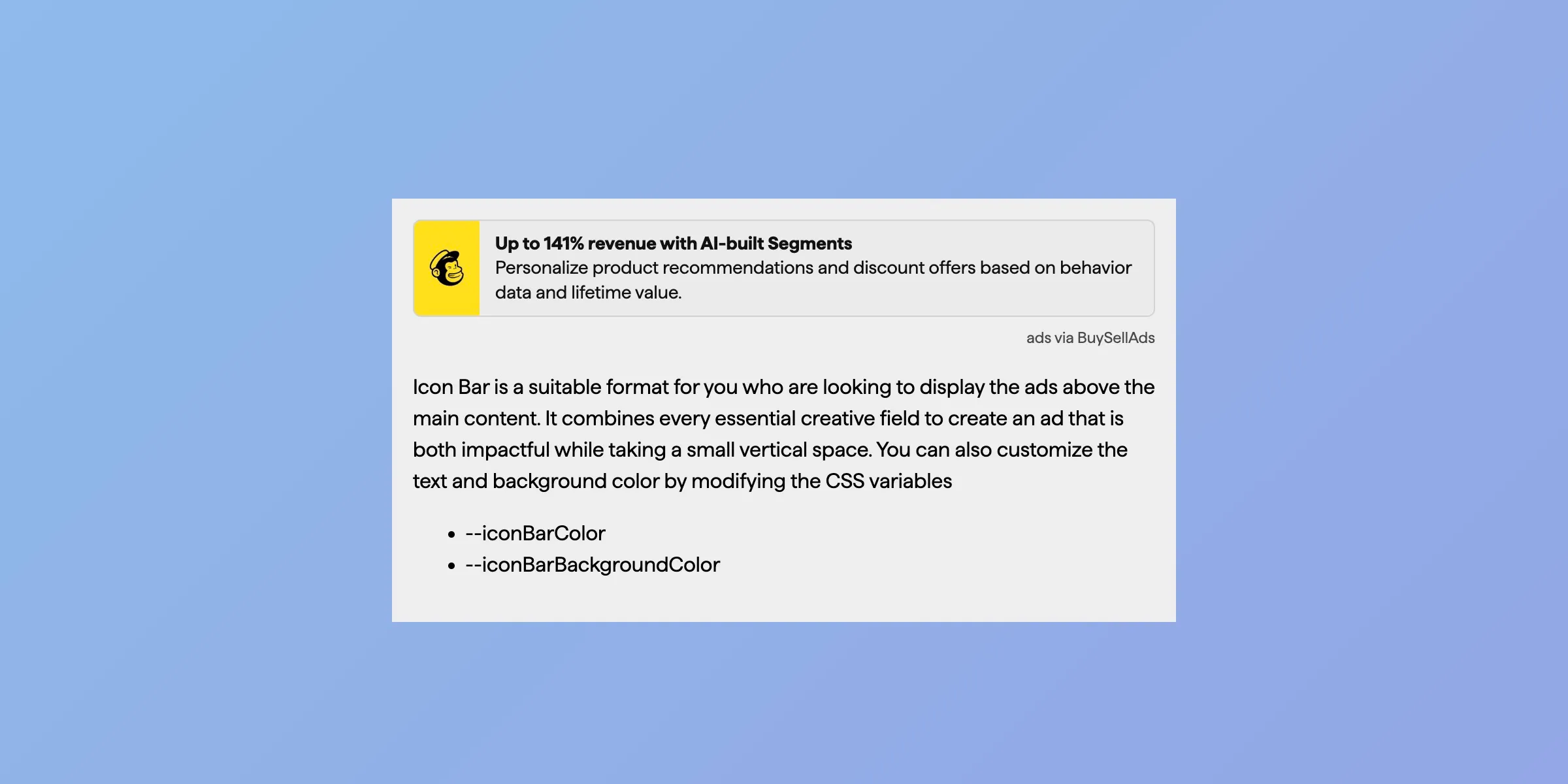
Icon Bar
View DemoIcon Bar format is ideal for displaying ads above the main content, making it a sleek and effective choice for maximum visibility and engagement.
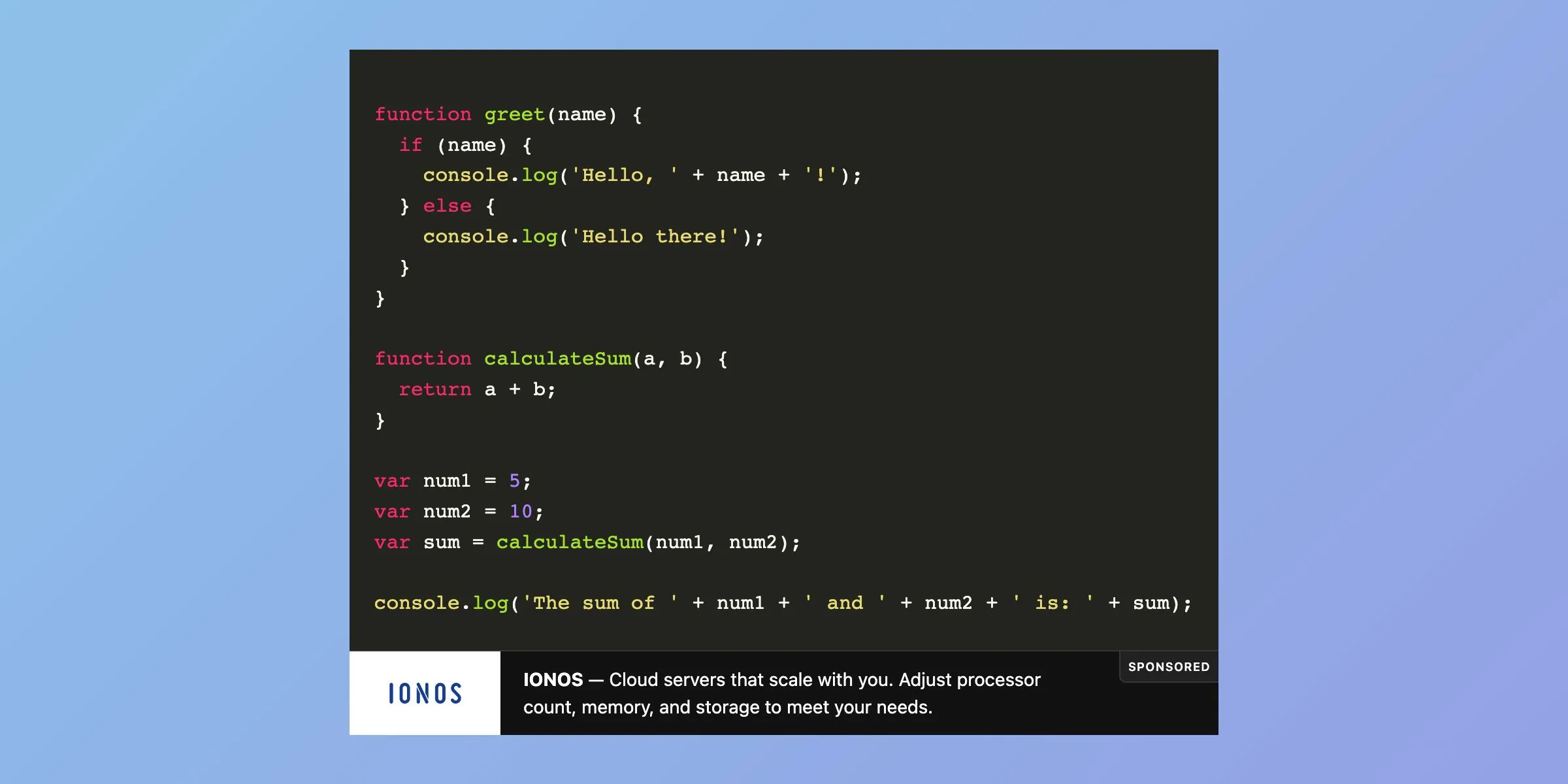
Logo Bar
View DemoLogo Bar takes up only a small vertical space and requires just enough horizontal space to make the ad stand out. Place it inside code and text editors for best performance.

Responsive Banner
View DemoResponsive Banner seamless resizes itself by following the space of the container. The brand colors help this ad format to stand out while keeping the design consistent across the site.
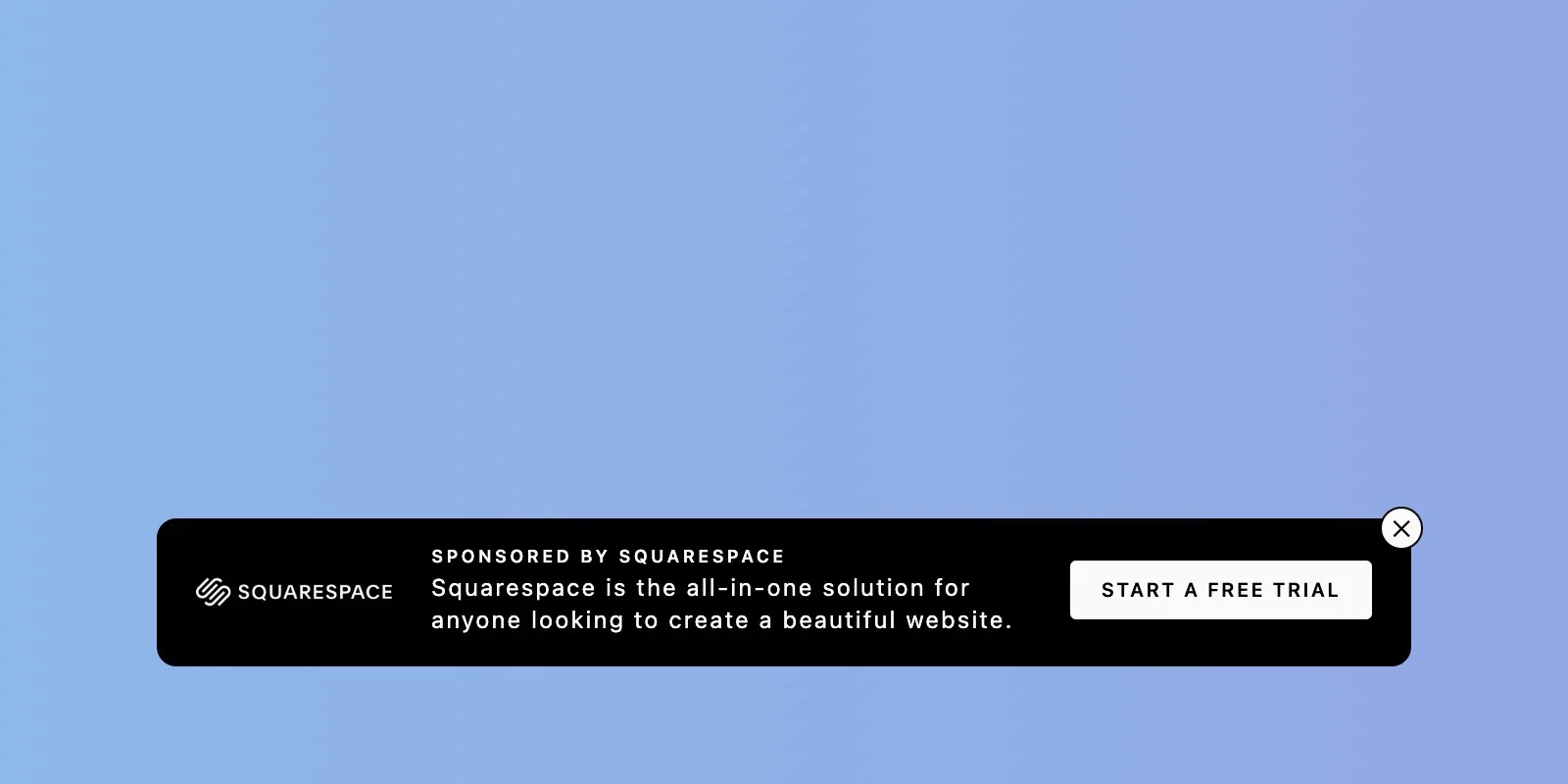
Sticky Bar
View DemoSticky Bar floats near the bottom and on top of the site. It puts the focus on the site content and waits for the site visitors reading flow to notice the ad.

Sticky Box
View DemoSticky Box stays in the corner of the page because it doesn't want too much attention. It complements well with Flex Bar who prefers to remain on the top of the page.

Wall Card
View DemoThe rectangle dimension makes Wall Card a suitable ad unit in the sidebar. You can also display them as part of the pop-up element, such as the post-download UI element.